Every shot has potential. Make it perfect.
Cinematic superpowers. Ultra smooth. Sharp. Steady.
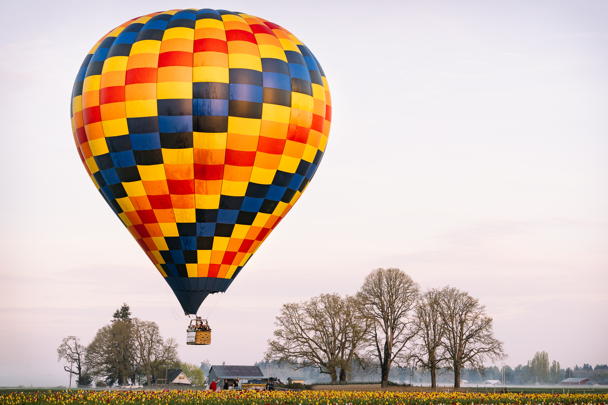
Super scale any image with AI. Like magic.
Insightful articles and videos to help you improve your photo and video quality.
Major updates to the Standard model and the new High Quality model, in addition to lots of performance improvements, makes Gigapixel AI even better at upscaling your photos.
Topaz Photo AI v1.1.5 introduces numerous model enhancements delivering more accurate image quality improvements and lots of important bug fixes.
We're continuing to make Topaz Video AI produce even higher quality videos and run even faster. Learn about all the improvements now available.
See how Topaz Photo AI v1.1. delivers even better image quality performance on Autopilot, including remarkable RAW noise reduction and more accurate noise detection.
Jeremy Neipp shares his thoughts on how using Topaz Photo AI can help him tell the intended stories of his wildlife photos.
Learn all about the new features and improvements we're adding to Topaz Photo AI with our weekly updates!
We built Topaz Video AI v3.0 from the ground up to include new functionality, such as video stabilization, improved enhancement capabilities, and a better user experience.
Every Autumn, photographers look forward to capturing the beauty of Fall colors. James Brandon shares his tips to ensure high quality results.
If you're traveling and want to get the most out of your photography adventure, you need to ensure that you have the right camera gear in your bag.
Learn about how Topaz Photo AI will help photographers maximize image quality faster and more accurately than ever.
This guide will inspire you to slow down and take care to capture both the journey and the destination of your travel photography.
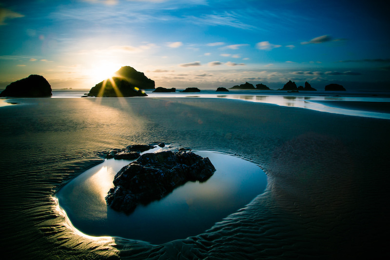
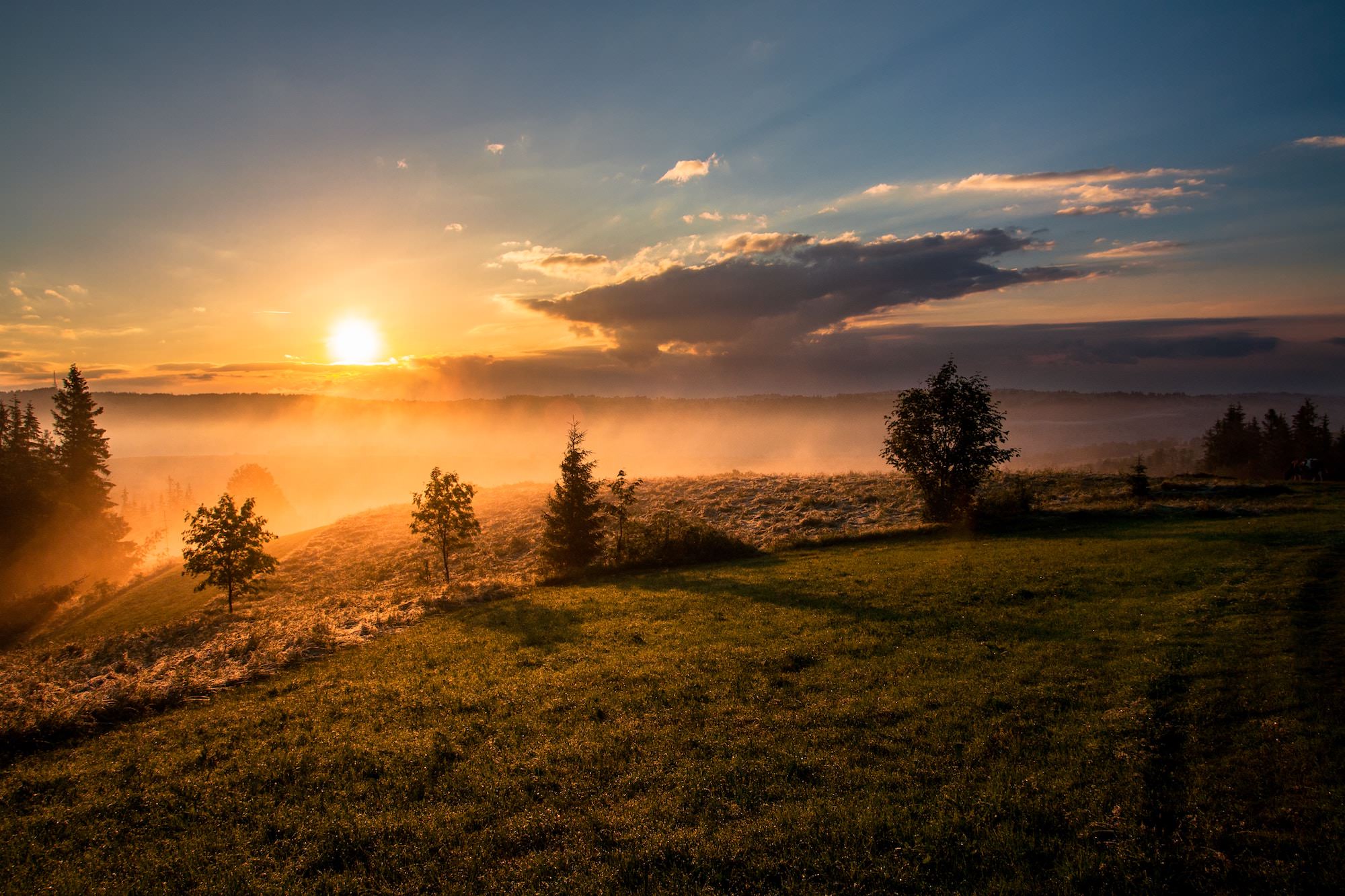
Read our guide to learn the ideal camera settings for sunset photography, how to photograph sunsets, and how to edit sunset photography at home.
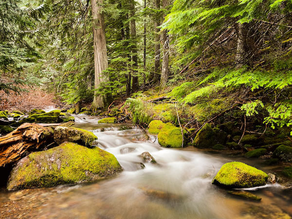
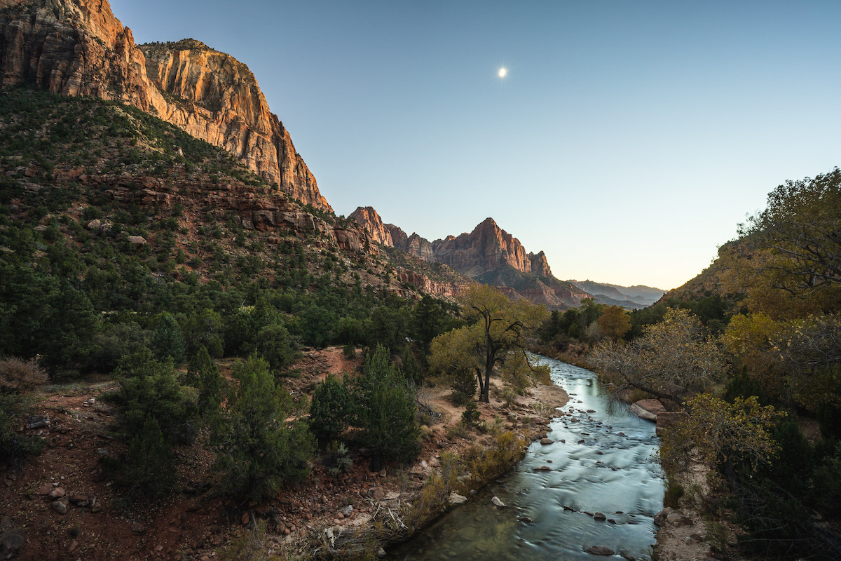
Looking for some outside-of-the-box landscape photography tips? We're discussing how to plan for and take landscape photos like a pro.
Travel portrait photography can be a nerve-wracking experience for some photographers. That's why we're sharing these 5 practical tips to help you feel more comfortable taking travel portrait photos.
Smartphone photography has exploded in recent years. This article will help you get more creative and higher quality photos using your mobile phone camera.
Learn why Gigapixel AI's updated Face Recovery model provides superior upscaled portrait photo results.
Knowing what shutter speed to use is crucial for quality photos. Read the Topaz Labs guide on the best shutter speed for wildlife, portraits, sports, and other photography genres.
Gigapixel AI v6.0 brings major performance improvements thanks to native Apple M1 support, more accurate models, and lots of important bug fixes
Film photographer David Imel shares the steps he takes to develop, scan, and upscale his analog film photos so that they can be shared online.
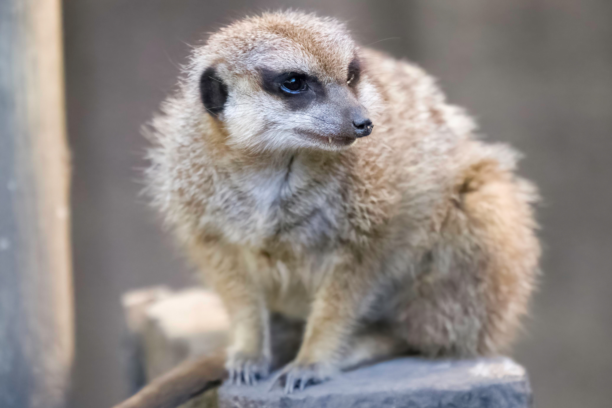
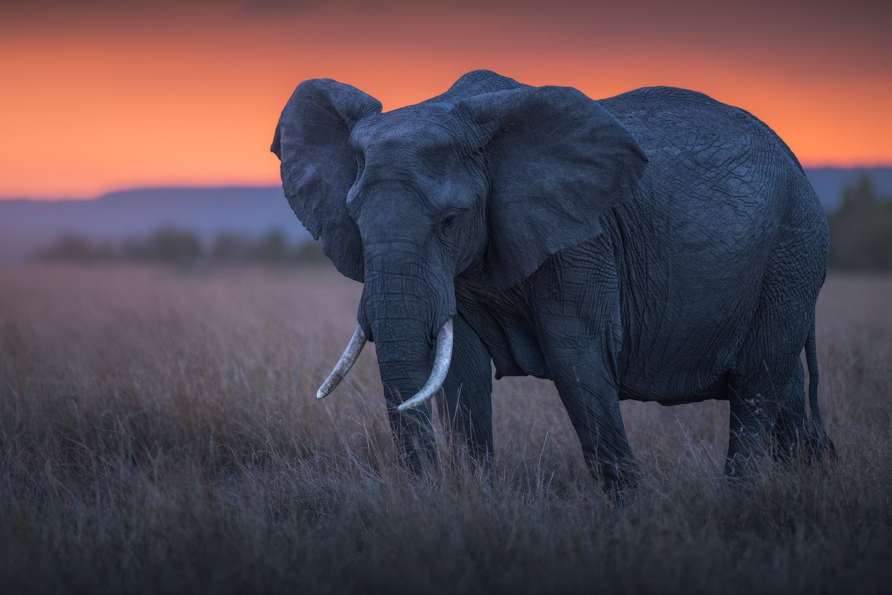
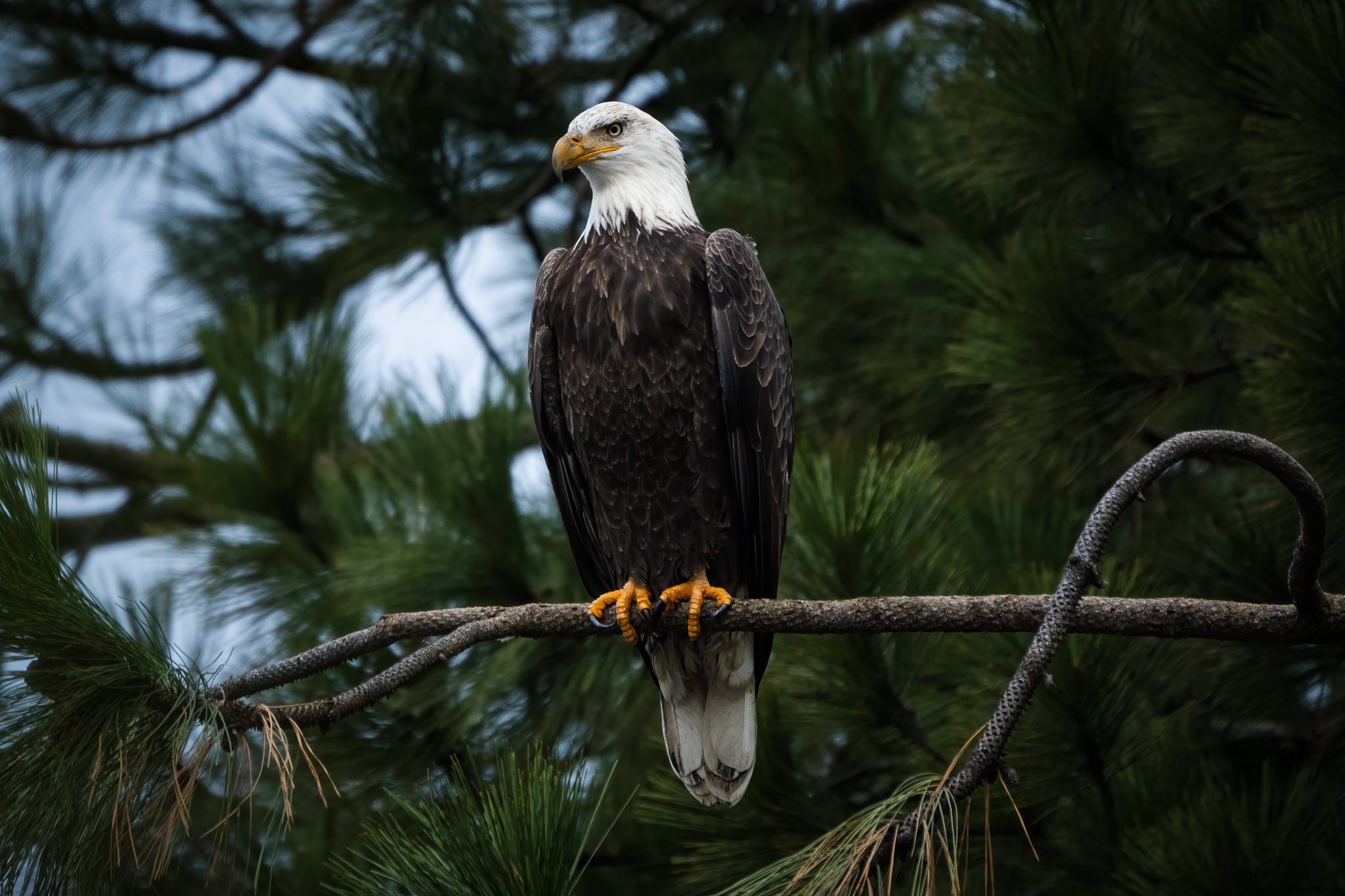
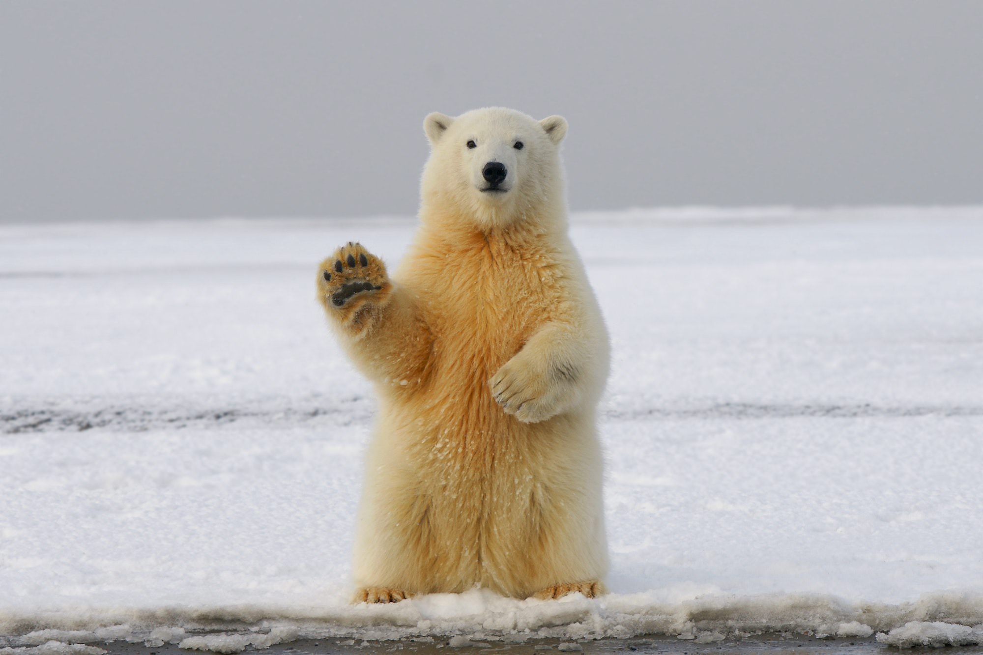
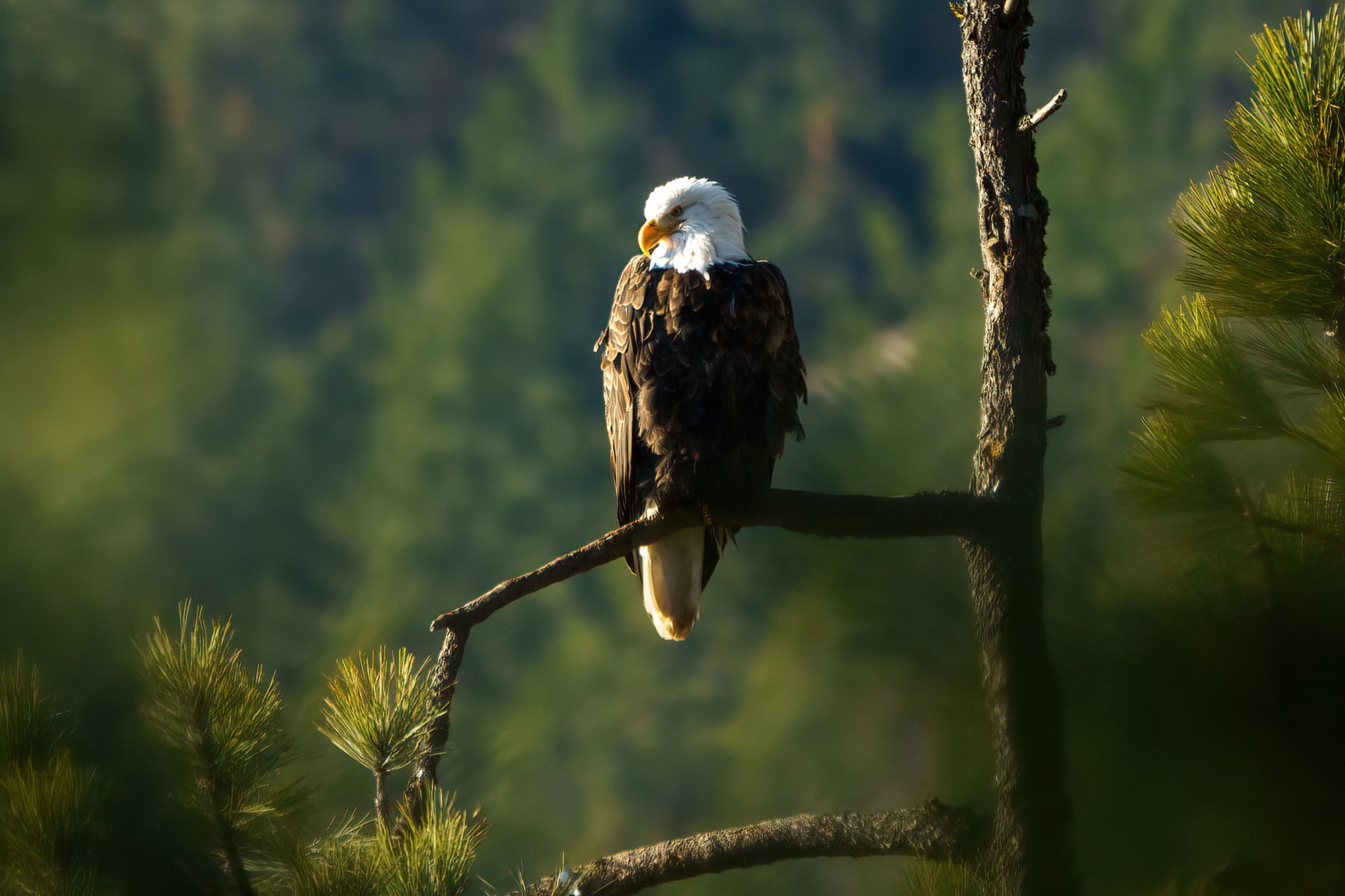
Professional photographer, Bill Maynard, goes deep by providing five insightful wildlife photography tips to help you elevate your photography skills.
We've made a lot of improvements to the way you upscale and enlarge your photos, especially portrait photos. With Gigapixel AI v5.8, you'll get improved face refinement, faster performance, and a lot more!
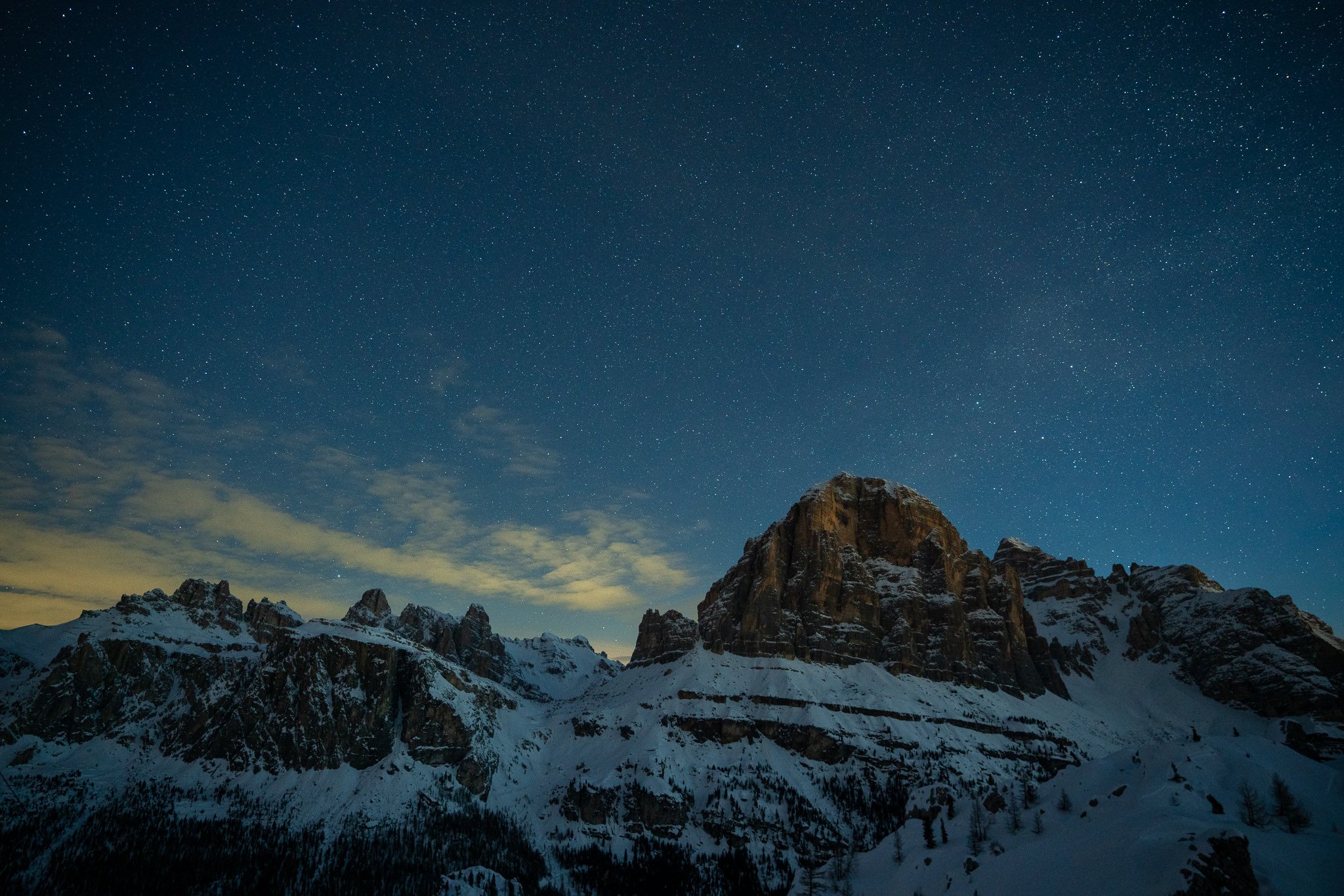
One of the most popular types of landscape photography is at night under a sky filled with stars. While this type of photography comes with its own sets of challenges, we're sharing 5 helpful tips to get sharper night photos while also removing distracting image noise.
It's important to know which applications will work best to suit the needs of your wildlife photo editing workflow. Check out how our AI-powered, purpose-driven apps help you achieve outstanding image quality.
Gigapixel AI v5.7 brings a number of important improvements that will provide even better image upscaling, including a new General AI model, an improved cropping experience, and a bunch of bug fixes.
There are several reasons why you'd want to enlarge your photos and a number of ways to do so. However, only Gigapixel AI can upscale your photos up to 600% without losing quality. Click through to see how.
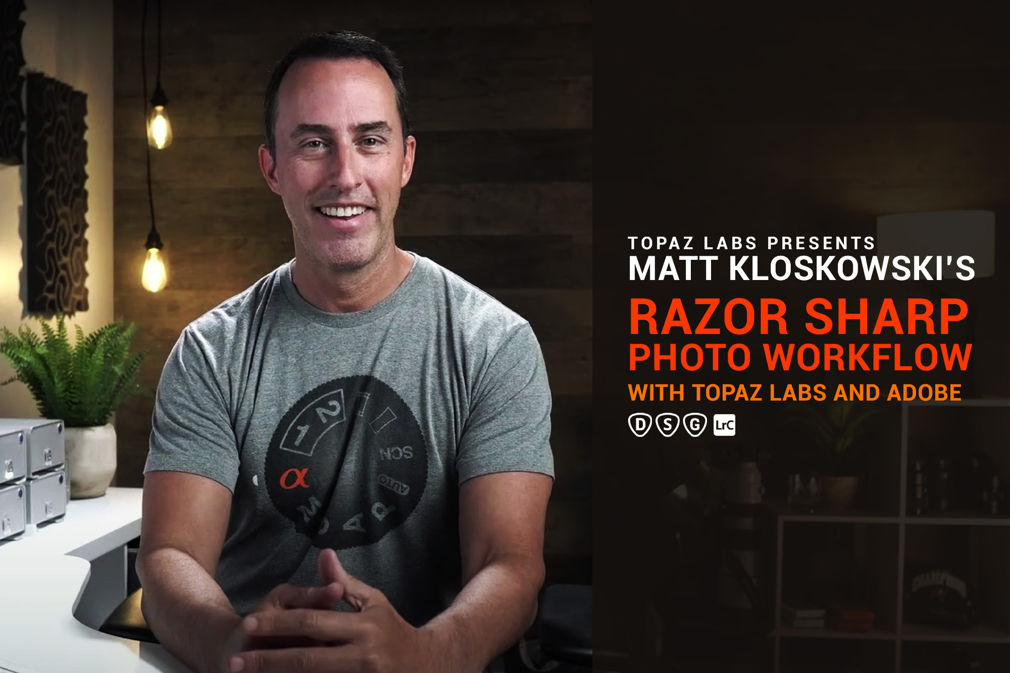
Join photo educator, Matt Kloskowski, as he shares every detail about his wildlife photo editing workflow. He'll cover how he uses our apps and which order he prefers using them.
In this new series, you'll learn how your photo editing workflow can help you get even better image quality using a combination of our programs and other external applications.
Gigapixel AI v5.6 brings a bunch of important usability improvements like the all-new Comparison View and better RAW/DNG color support. We've also auto-optimized performance based on your computer hardware.
At Topaz Labs, we develop cutting edge AI applications to “auto-magically” enhance the objective quality of your images and video. Click through to learn more about our development process including the challenges we strive to overcome.
Getting better holiday photos can be challenging with no do-overs. When you make that "almost" perfect shot, our AI apps will come to the rescue. Click through to see how easy it can be to elevate your holiday photos.
Sometimes you want to work with a portion of a photo, but “cropping in” reduces resolution. Gigapixel AI helps you crop images without compromising your pixel count. Click through to learn more.
No matter how skilled of a photographer you are, there will always be difficult-to-correct issues that happen to your best shots. So, what can you do when you run into one of these nearly impossible-to-rescue photos? Here are a few pointers!
We love hearing from our amazing users and we've made it easier than ever to share your thoughts using video! Take a minute and let us know what you think about our apps!
Bill Maynard returns with a very helpful guide to getting sharp wildlife photos using practical methods. There's plenty to learn, so let's get started!
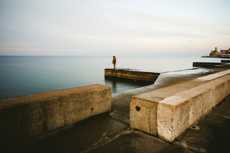
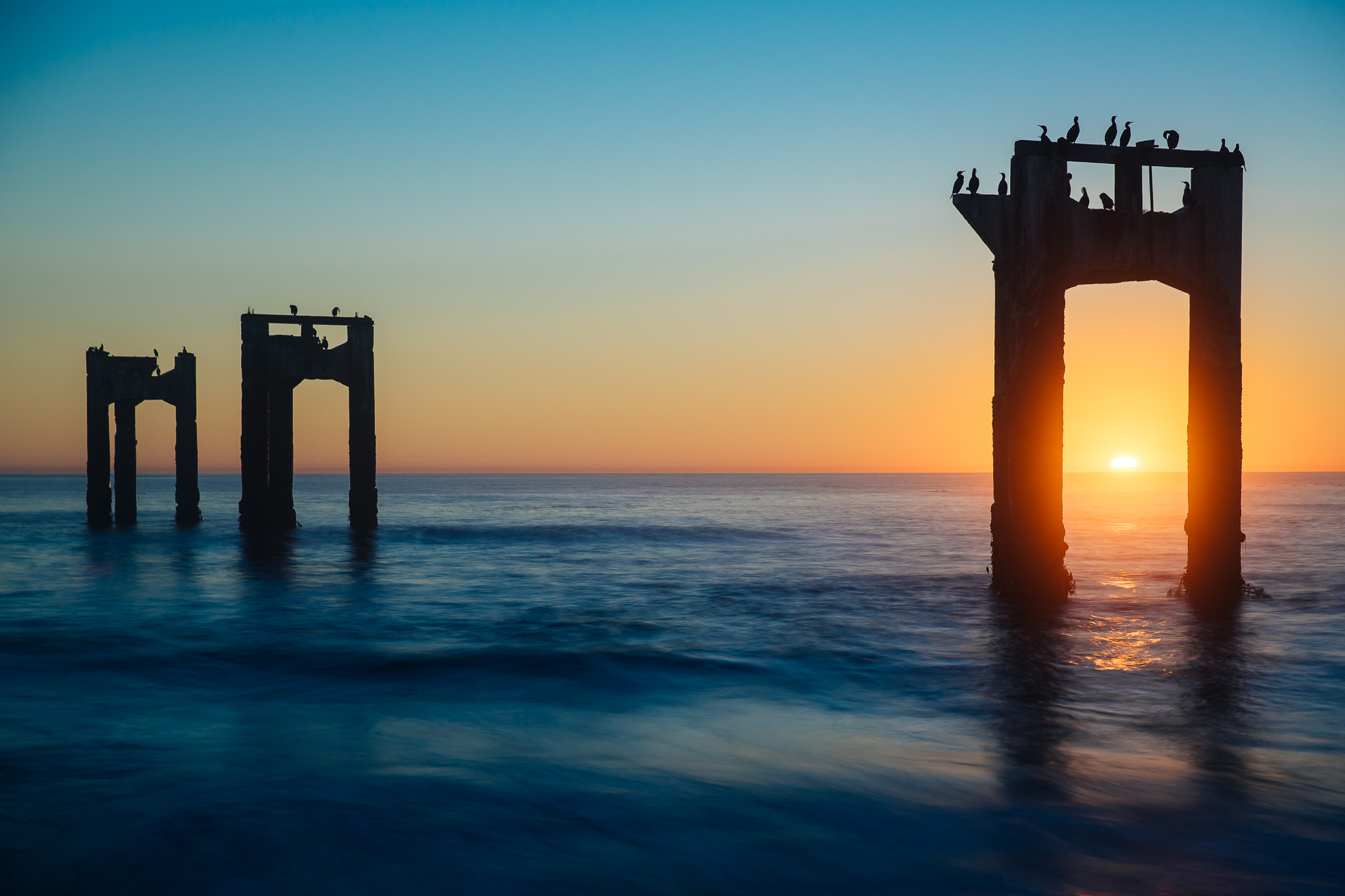
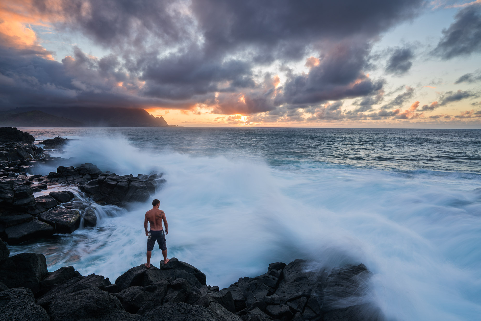
There are many things to consider when photographing moving water, especially along the coast. James Brandon shares some of his most important tips to safely get those amazing shots.
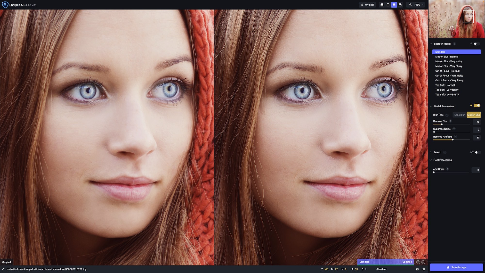
Mark Dumbleton returns to share deep insights into how you can ensure getting tack sharp photos every time using Sharpen AI and Lightroom
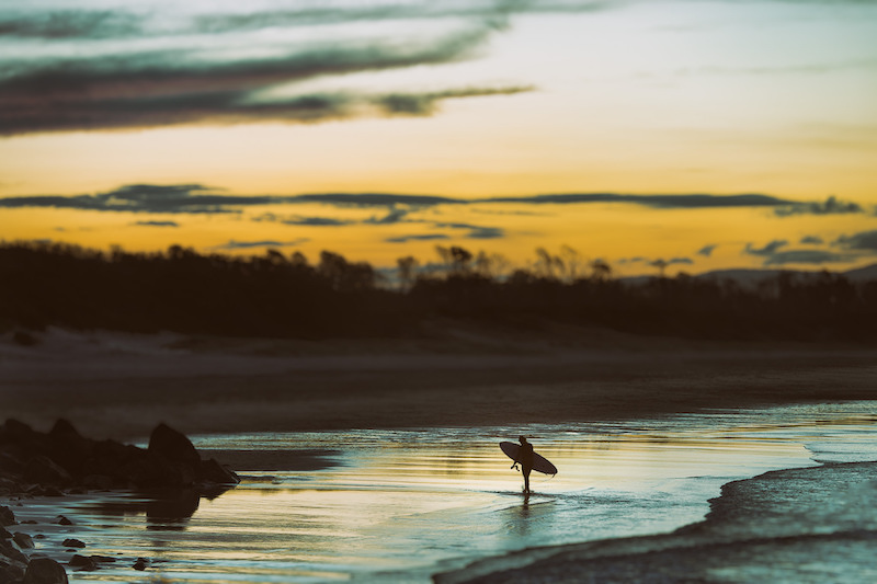
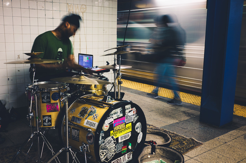
Learning how to do street photography requires dedication and patience. That's why we're discussing the basics of street photography and tips to get started.
James Brandon joins us to explain why missing focus doesn't have to be the kiss of death for your photos thanks to Sharpen AI.
Photographing in cold, snowy conditions can be difficult to some photographers. This article will help you learn to overcome the challenges of photographing winter subjects.
Mark Dumbleton is not afraid to take photographs using high ISO settings and he breaks down all the reasons why in this new guide to high ISO photography.
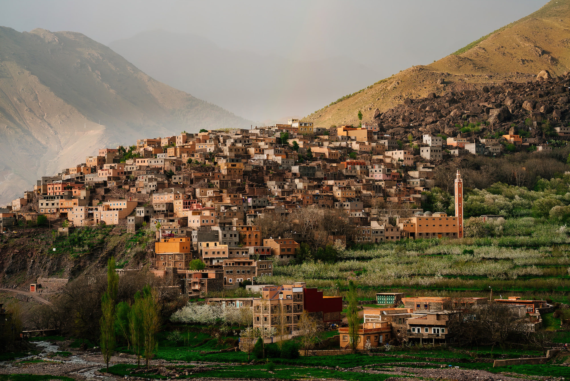
While we may tend to think of a photographic landscape as a scene from nature, an urban environment, or city, can provide equally compelling opportunities to shoot, as well.
Low light photography can be challenging. Read our Topaz Labs guide on the best low light camera settings and helpful tips for amazing photos.
Learn all about the significant improvements we made to our auto-detect masking tools and more convenient batch model downloads
Sharpen AI v4.0 brings several important updates including native Apple M1 support, a new Standard AI model, and lots of stability improvements. Click through to learn more and try it out for free.
Of all the exposure settings you can dial in, the shutter speed can offer the most creative opportunities with your photos. We'll go over some of the most popular creative uses for shutter speed in this article.
This wildlife photo editing workflow video is made for photographers who use the newer Lightroom Desktop to manage their photos. You'll also learn how to access the Topaz Labs apps using Adobe Photoshop as the conduit.
Sharpen AI v3.3 has a lot of under-the-hood improvements that will make AI model management, cropping, and overall usability a lot better. Download it today and try it out with your images!
Dan Zafra knows a thing or two about getting stunning Milky Way photographs and he's sharing 8 easy tips to help you get your own beautiful night photos.
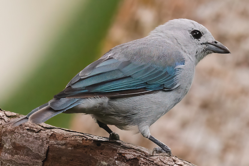
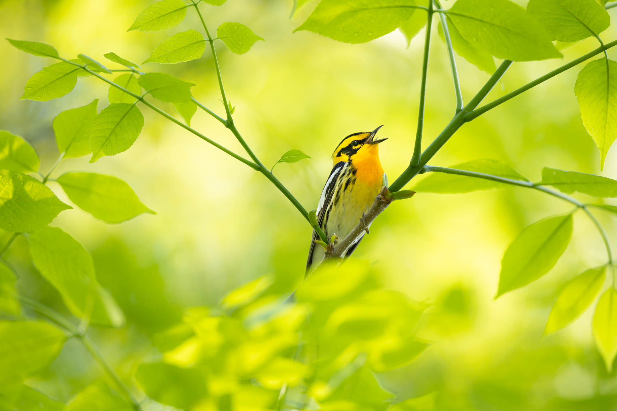
Wildlife photographer Rina Miele breaks down some of her favorite practical tips to improve bird photography taken in your own backyard.
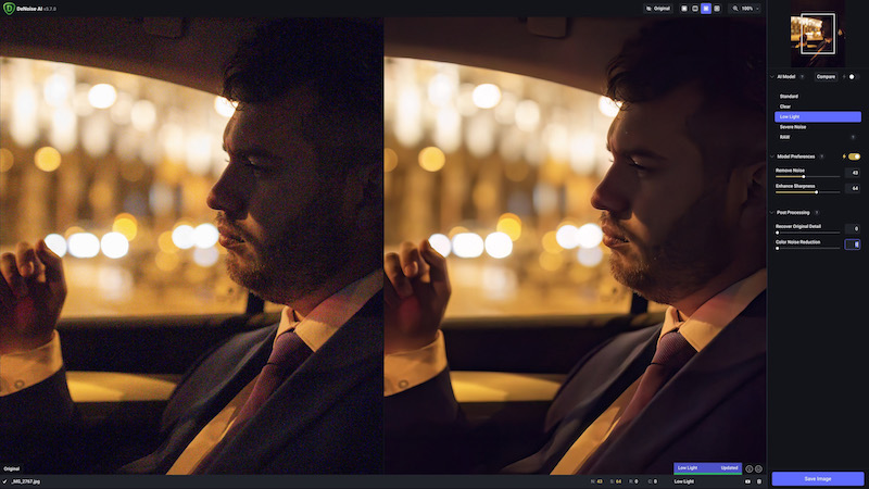
Our latest update to DeNoise AI improves on the Low Light model, providing better color consistency and noise reduction, in addition to so much more!
Photographing a city at night can be both challenging and very rewarding. These tips will help you be safe and get the most out of capturing an urban environment after dark.
This latest update to DeNoise AI introduces an updated RAW model, improved file saving workflows, and several important stability fixes
We thought it'd be fun to share a quick editing tutorial to help you add some extra pop to your family holiday photos using layer blending modes. We hope you enjoy it and wish you very happy holidays!
DeNoise AI v3.4 brings faster performance than ever, especially for Apple M1 users. We've also updated our AI Engine and RAW library to provide speedier processing and a far more stable experience for all users.
This article will help you determine how to get the best results using the new DeNoise AI RAW model. We'll cover various examples showing when it makes sense to use the RAW model workflow and traditional workflows.
The DeNoise AI RAW model delivers the cleanest possible image noise reduction and no other application comes close to its performance. This article explains why we built the RAW model and how it fits within your photo editing workflow.
We've got A LOT of major improvements with DeNoise AI v3.3! A brand new RAW model provides the cleanest noise reduction out there, plus an improved Comparison View, an updated Low Light model, and so much more!
In this Video Enhance AI tutorial, we'll show you how to make videos HD by upscaling resolution while improving details.
The focus for Video Enhance AI v2.6 is all about performance improvements. With native Apple M1 support and a bunch of new AI model updates, getting higher quality video is faster than ever.
Creating videos for YouTube is more popular than ever, but the process of creating them can overwhelm some people. These three beginner tips will give you a strong foundation to improve the quality of your videos so that they look great for your YouTube viewers.
If you've ever been interested in getting stunning and realistic 60 fps frame rate conversions for your video footage, then you'll definitely want to read this article.
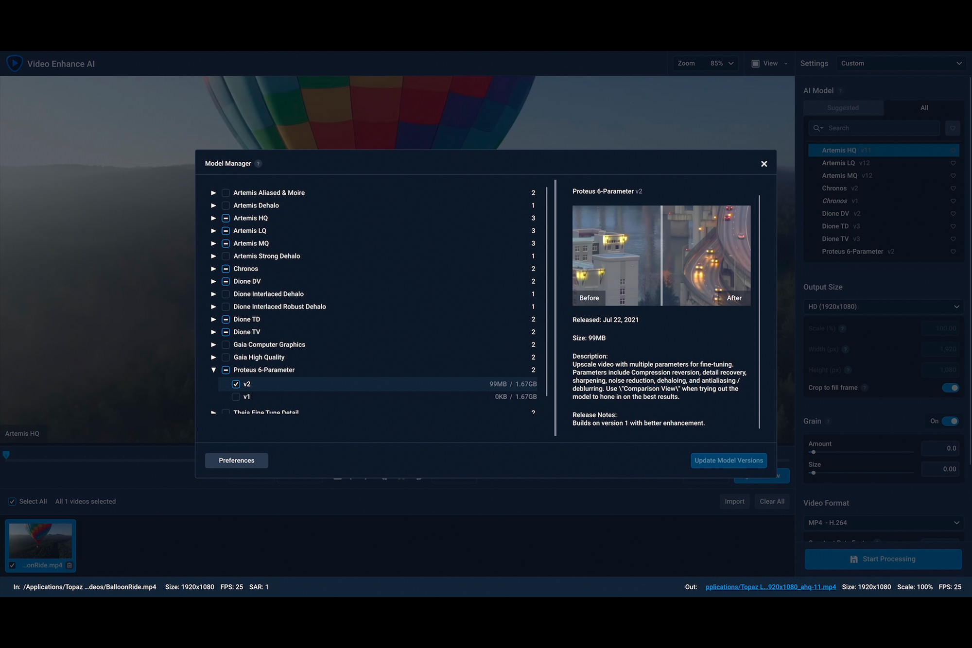
The new Video Enhance AI Model Manager makes it easy to get stunning video improvement using cutting-edge AI technologies. Click through to learn why we built it.
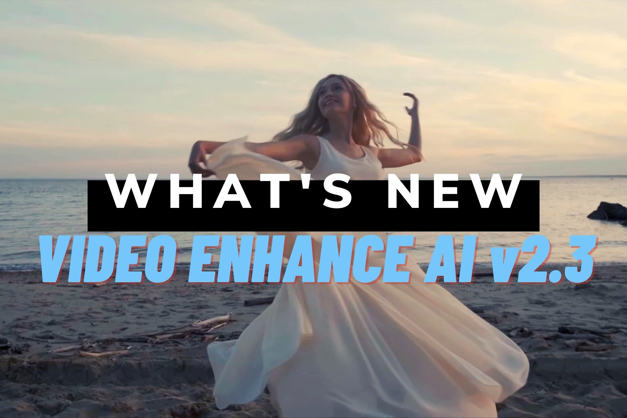
Get flexible frame rate conversion, realistic slow motion, and fine-tuned enhancement controls for your videos using Video Enhance AI v2.3. Click the title to read more...